


Brand strategy
Positioning, audience, narrative and values — specific enough to make identity decisions crisp, not a generic 'innovative, customer-focused' slide.
Marketing · Branding
Brand systems built to ship into production, not sit in a deck. Identity, web, pitch decks and motion — delivered into the tools your team actually uses.
Corum8 is a branding and design studio for Web3, AI, fintech and enterprise companies. Work covers brand strategy, verbal and visual identity, design-system implementation, web design, pitch-deck design and motion graphics — applied consistently across product, marketing, sales and investor surfaces, not delivered as a PDF nobody uses.
What's included
Positioning, audience, narrative and values — specific enough to make identity decisions crisp, not a generic 'innovative, customer-focused' slide.
Voice principles, do/don't examples, message architecture and category-specific language that reads distinct without a style guide open.
Logo, color, typography, grid systems and graphic language — explored across 3-5 directions, then refined and built out as a full system.
Figma component libraries and CSS tokens engineers actually consume — React/Vue starter kits where appropriate, documented at usability grade.
Pitch, investor-update, board and sales deck templates with real placeholder content — not a masterfile nobody updates.
Marketing sites that apply identity across every page, with engineering hand-off specified down to breakpoints and animation.
Product explainer videos, brand films, stage graphics and social-native motion built to the identity's animation rules.
A phased rollout plan that gets marketing, product and investor comms onto the new identity at the same time, not staggered over a year.
Is this you?
You don't need all of them. One is usually enough to justify the call.
You're raising a Series A, B or C and the design of your deck is working against the story, not for it.
Your product is genuinely good, but the brand doesn't communicate what it actually does.
Product, marketing and sales are each making design decisions from different starting assumptions, with nobody coordinating.
You're rebranding because who you are now doesn't match the identity you shipped with two years ago.
You need positioning that differentiates you from established incumbents already occupying the space.
You're watching competitors gain mindshare with a better-told story, not a better product.
Sectors
One studio-plus-implementation practice across every category.

Identity that reads recognizably Web3, or deliberately doesn't — your call, our craft.

Rebrands that move a crypto-native aesthetic into institutional territory.

Identity that signals intelligence without the default glowing-gradient AI tropes.

Master brand systems with portfolio-support kits for co-branded material.

Identity and deck systems built to survive investor and community scrutiny.

Trust-signaling visual systems for high-consideration financial products.

Institutional-grade identity for audiences that read credibility fast.

Identity systems built for audiences outside the crypto-native default.

Identity that grows with the company — light enough to ship at pre-seed, structured enough to survive a Series C raise.
Selected work
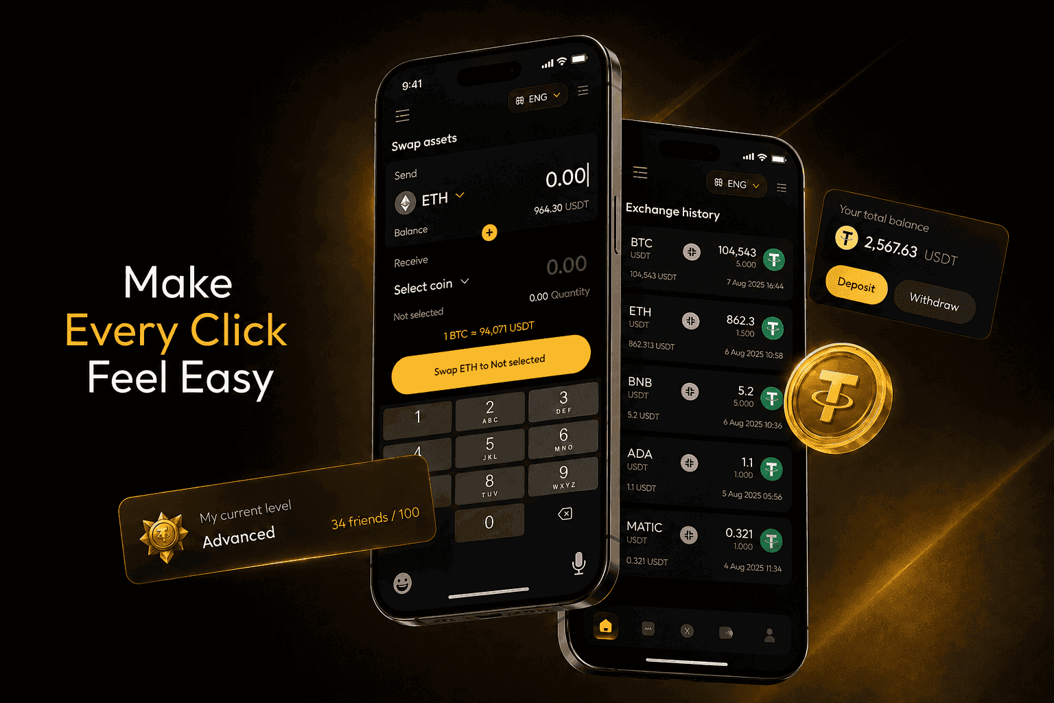
Illustrative of the surface types we build identity and UI systems for — mobile app and web platform work, brand detail withheld under client NDA.
Fintech Wallet App
Checkout & Payments Flow
Trading Dashboard
Exchange Platform
Process
Structured interviews with leadership, customers and sometimes lost prospects — what the company actually is, not how it describes itself.
Positioning and narrative specific enough to make identity decisions crisp, signed off before any visual work starts.
Concept exploration across several directions, then one refined and built into a full identity system.
Design tokens, component libraries and deck templates delivered into the tools your team actually uses.
Case studies
An AI product avoiding generic visual tropes, and a venture firm needing one consistent brand system across 40-plus portfolio companies.
A consumer AI product for creative professionals needed to avoid generic AI visual tropes — glowing gradients, neural-network illustrations — while still communicating intelligence. An identity built around craft and human-creative themes, with a subtle motion system, materially improved marketing response rates.
A VC firm's 40+ portfolio companies each used inconsistent design systems whenever co-branded content appeared. A master brand system plus a portfolio-support toolkit — templates and tokens portfolio companies could use directly — visibly improved LP-facing material quality and cut internal support bandwidth.
Why Corum8
Mobile-first, the Web3 aesthetic era, AI-product emergence and now institutional-fintech convergence — the discipline was built across all of it.
Most studios do strategic briefs or production-grade implementation well. We bridge both under one roof.
No handoff between a strategy consultancy, a branding studio and a web shop — the usual place brand integrity gets lost.
Design tokens and component libraries engineers actually consume, not a PDF style guide nobody can implement.
Explicit sign-off gates at each phase prevent the endless-iteration problem common to branding engagements.
The PR campaign uses the new positioning, performance ads use the new creative system, community sounds like the new voice.
What drives scope
Branding cost scales with scope tier, application depth and implementation level.
Strategy-only is one scope; strategy plus identity is the next; strategy, identity and full application across web, decks, motion and product is the heaviest.
A single-brand identity is one level; multi-brand architecture with sub-brands or product families is meaningfully more complex.
A 12-page marketing site is lighter than a 60-page multi-product site with a docs portal and developer portal.
A single pitch-deck template is quick work; a full system spanning pitch, investor update, board and sales decks with motion is a real project.
Motion guidelines are part of identity; produced videos like explainer films or brand films are separate production work.
Delivering Figma files is lighter than building out code component libraries with Storybook — heavier upfront, dramatically more useful after delivery.
FAQ
Branding is the strategic and design work that defines how a company presents itself — positioning, voice and visual identity applied across every surface from product UI to investor decks. Work spans brand strategy, verbal identity, visual identity, design-system implementation, web design, deck design and motion graphics, delivered as one integrated program rather than separate handoffs.
Cost is driven by scope tier, identity complexity, web design depth, deck system depth, motion scope and level of code implementation. A strategy-only engagement is light; a full rebrand with a 40-page site, complete deck system and an implemented component library is substantial. We scope against what needs delivering.
Both — work ranges from a light identity refresh to a full rebrand to new-brand development for a new company or product line. A refresh fits when positioning is right but the visual expression feels dated; a full rebrand fits when positioning has materially changed or the current identity is actively limiting the company.
Strategic discovery, brand strategy, verbal identity, visual identity, a Figma design system with CSS tokens, web design with engineering hand-off, a deck template system, motion guidelines and a coordinated rollout plan. Web engineering beyond hand-off, produced video beyond motion guidelines, and physical print production are typically scoped separately.
Timeline depends on scope tier, identity complexity and how many surfaces need application — a strategy-only engagement moves faster than a full rebrand spanning identity, web, decks and motion. Discovery and strategy come first and get signed off before any visual work starts; identity exploration and application follow in phases, each with its own sign-off gate rather than open-ended iteration. We'll walk through what's realistic for your specific scope on a call.
Yes — Web3 branding is a core practice area, spanning protocols that want to read recognizably Web3 and Web3 companies moving deliberately toward an institutional aesthetic. The category has real visual conventions — glow palettes, crypto-punk typography, futuristic imagery — that get leveraged or rejected based on the strategic positioning, not by default.
Yes — full implementation in Framer, Webflow, Next.js, Astro or SvelteKit depending on fit, including CMS setup and hosting. Many clients prefer we design and hand off to in-house engineering; the component library and token extraction make that low-friction. Clients without in-house engineering usually prefer we implement end to end.
Yes — identity systems have shipped across six languages, with typography, voice and imagery adapted per market rather than a single system stretched to fit everywhere. Multi-region scope gets factored into the engagement plan from discovery onward, not bolted on afterward.
Yes — pitch and investor-deck design is often the highest-leverage work we do, frequently the difference between a raise closing quickly and slowly. Deck systems typically include the pitch deck itself plus investor-update, board and sales-deck templates built from the same visual system.
A full rebrand earns its place when the strategy underneath has genuinely changed. A new market, a new buyer, a merger, or a product that has outgrown the story it launched with — those need the whole system rebuilt. Where the positioning still holds and only the execution feels dated, a refresh gets you most of the impact for a fraction of the work: sharper visual system, better typography, cleaner assets. We will tell you which of the two you are looking at before scoping anything.